Capstone Project / iOS App / UX Design
An iOS application designed for the Pickleball community, serving as a platform for court location and social connections, with the potential for expansion into other sports.
Project
Academic, UX Diploma
Duration
10 weeks (April - June 2023)
My Role
UX Researcher, UX & UI designer
Tools
Figma, Illustrator, Pencil, Pen, Paper
Design Thinking Process
MethodologyBy employing the principles of design thinking and Human-Centered Design methodology, I applied the knowledge I acquired throughout the bootcamp, which encompassed user research, ideation, UI design, prototyping, and user testing. A summary of the steps I took are listed below.
Empathize
Steps: Secondary research, Interviewee criteria and guide, Interviews, Surveys
Define
Steps: Problem statement, Affinity map, Insights, Persona, Experience map, User stories/epics, Task flow
Ideate
Steps: Competitive analysis, UI inspiration, Exploratory sketching, Solution sketching
Prototype
Steps: Low fidelity wireframes, Mid fidelity wireframes, High fidelity wireframes
Test
Steps: 2 rounds of usability testing, 5 tasks tested, Task analysis, Prioritization matrix
Revise
Steps: Updated each version according to design priortization matrices, Total of 3 versions
Here come the
Gen Z Picklers!
Pickleball is a fast-paced and exciting paddle sport that combines elements of tennis, badminton, and table tennis. The sport has exceeded all expectations in terms of growth, it is now North America's most rapidly expanding sport.
Since 2020, the number of Canadian pickleball players has tripled to over 1 million.
This explosion in playership across multiple generations of Baby Boomers, Gen X, Millenials and Gen Z has created new opportunities for innovation with digital technologies.
The problem spaceProblem statement
There’s a primary need to find courts that are dry, well-maintained and have spots available. Secondly, there are coaching opportunities for youth, newcomers and for players who want to upskill. Lastly, finding partners and teammates is a challenge without a local player network.
Hypothesis
I believe that rapid growth in Pickleball players has led to a demand for digital technologies that can help find available and suitable courts.
I’ll know I’m right when:
The number of app users continuously grows
Positive ratings & reviews from players confirm how my app has helped them to quickly and easily find courts and coordinate Pickleball meetups with their friends.
Assumptions
I believe my customers have a need to:
Find well maintained courts when it’s convenient for them to play, learn skills and find players
These needs can be solved with/by:
Viewing all local courts availability and status, seeing who’s available to play, finding lessons
My initial users are (or will be):
Local players age 35-65 who are comfortable using digital apps
Secondary researchWhat’s happening in the world of Pickleball?
“The age group showing the fastest rate of growth are players aged 18 to 34…”
pickleballcanada.org“One of the challenges is, the sport is growing so quickly, that there aren’t enough courts across Canada…”
torontosun.com“…three of the four highest-paid American athletes are now Major League Pickleball owners…”
forbes.com“…Pickleball is getting ready for the Olympics…The sport’s insiders are indeed eye-balling a spot in the five-ring circus…”
torontosun.comPrimary researchInterviews
To gain a deeper understanding of the Pickleball community I conducted 3 interviews and collected survey data from an additional 10 participants.
Participant criteria
Canadian citizens in BC
Living in Metro Vancouver
Between the ages of 35-74
Actively play Pickleball
Skills range from beginner to experienced
Interview guide
“During this interview, I’ll ask you a set of questions about your own Pickleball experiences.
Please be aware that there are no wrong answers as I’m interested in your own perspective on the subject. Your feedback will be very valuable to me and will be used to inform my design decisions.”
“...if you're not on [SignUpGenius] within 3-5 minutes you don't get in…and the problem is we have 13 courts with 750 members”
-David“Some people take it really seriously…I just don't know where you play casually anymore”
-Annette“We have a WhatsApp group, so we say who wants to play at 1pm…because it's quite busy in the mornings”
-JaneAffinity mapSynthesizing results
During my affinity mapping, I collected a significant amount of pain points indicating that Finding a place to play was a very common theme.
Theme: where to play
Insight: finding a court to play can be one of the top challenges for a player especially if they don’t have a group who can meetup regularly and claim a court.
Click image to enlarge
PersonaMeet Elli
Having consolidated all my research findings about my primary users during previous steps of interviews and affinity mapping, I created a persona that represents the core attributes of my target user.
Elli finds it tough to find places to play that are not too busy and close by.
In her own words,
“Pickleball is so great for me. I’m addicted to playing but I don’t want to leave my kids home alone for too long so I need to know where I’m going to be playing, for how long and I have to be fairly close to home.”
Click image to enlarge
Identifing opportunities
With Elli as my primary user, I mapped out her journey of finding a court to play on and identified potential opportunities for digital intervention.
Experience mapCheck into a court
Message players
See court + player availability
Click image to enlarge
HMW
With my key theme of Where to Play and its insight in mind, I wrote an HMW statement to frame my problem to be solved. I could now ask the question:
How might we help Pickleball players easily locate well-maintained courts to play at times that are convenient for them and avoid congestion at some courts?
What would Elli do?
User stories, epic + task flowWith user stories and epics narrowed down, I designed a task flow that my primary user, Elli, could take and that aligned with my chosen user story.
Epic: Location finder
User story: As a Player, I want to be able to find and share a local place to play with available courts, amenities and the equipment I require so that I can be prepared, enjoy my game and have a comfortable playing experience.
Task flow: Find and share a local court’s info and availability in an iOS native app
Click image to enlarge
Ideation
UI Inspo
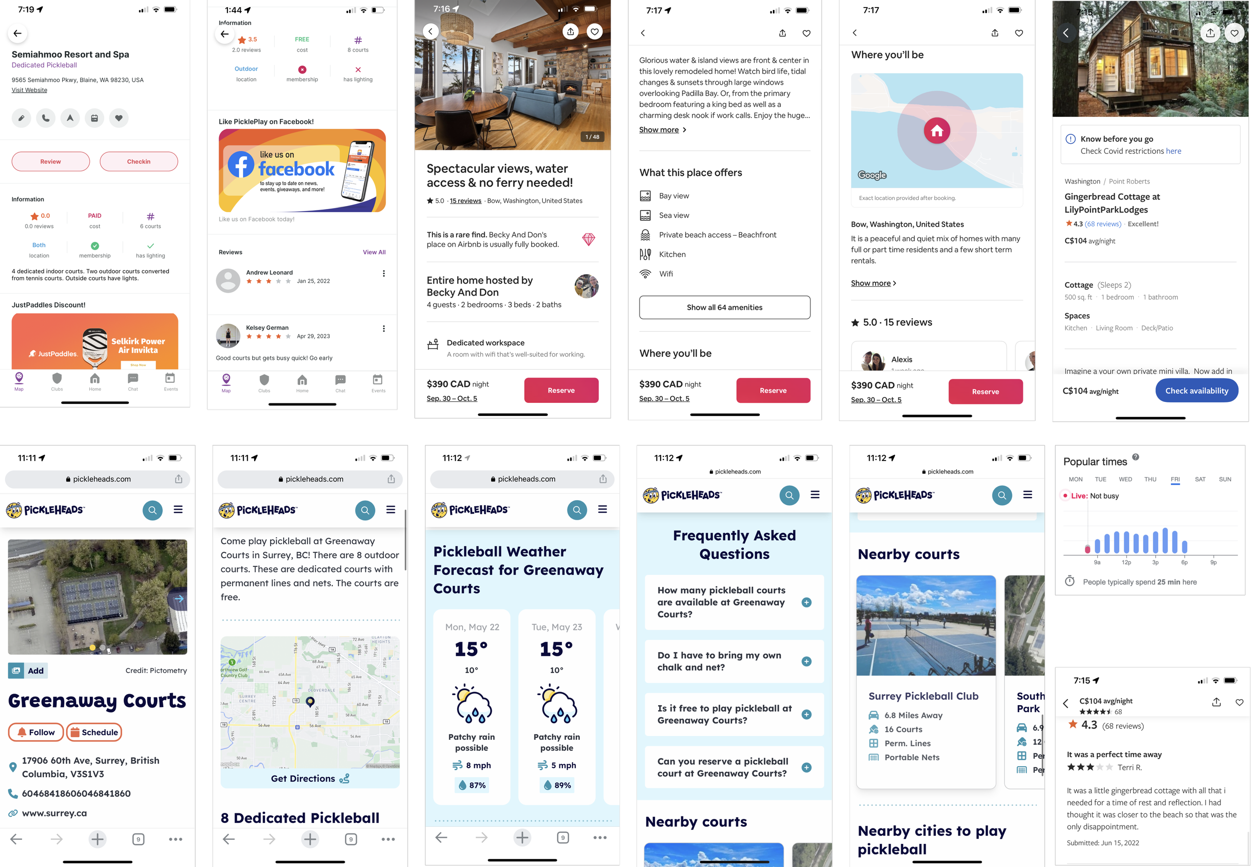
With an understanding of Elli’s task flow, I knew what features and components she may use in a digital app. I looked for inspiration and UI ideas to inform my sketches of my key screens. Below are inspiration boards for the home, details page, and search + map screens.
Click image to enlarge
Playing with ideas
SketchesExploratory Sketches
During my ideation phase, I was inspired by competitor sites/apps including some non-related apps. I quickly sketched various features and components that I thought would be useful in my app.
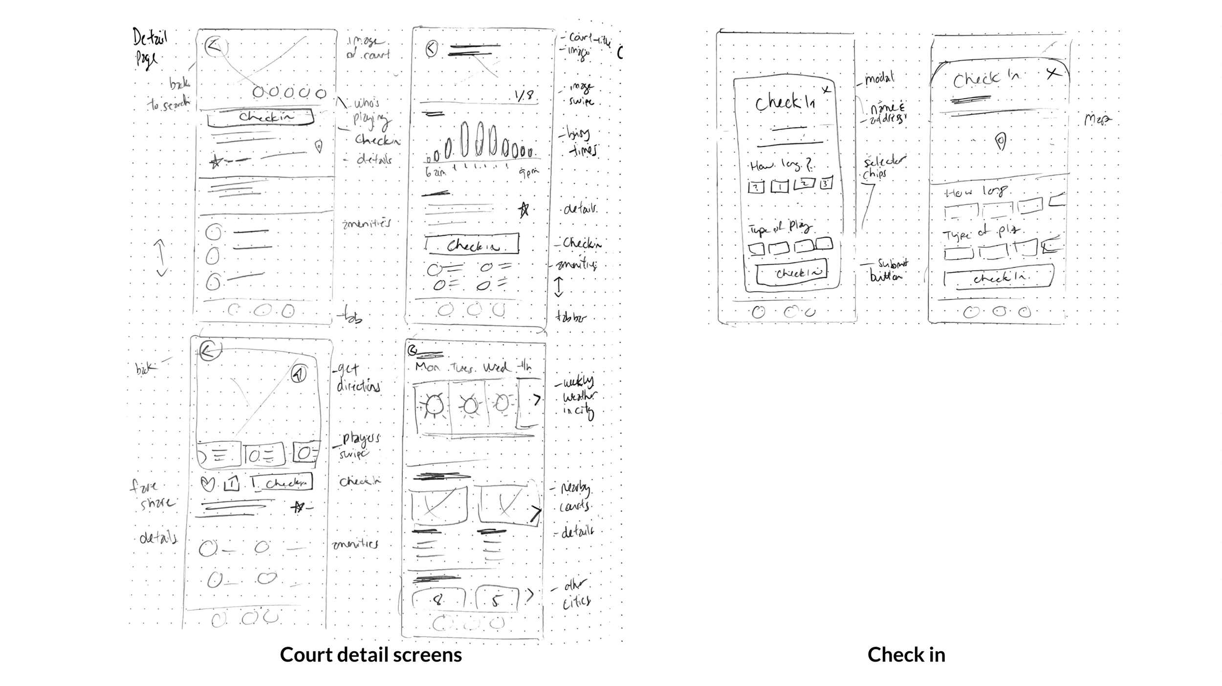
Solution Sketches
I redrew my key screens to hone in on the important features and components on the Home, Court detail and Search screens.
Click image to enlarge
Digitizing sketches
WireframesWith my sketches to guide me, I could start designing wireframes. Here’s a comparison of key screens across three versions.
Click image to enlarge
Iteration
User testingI conducted two rounds of user testing each revealing usability issues which I then prioritized into solutions for the next prototype version.
Round 1 user testing
-
Path to check not a clear as it could be
The court section is not prominent enough on the home screen
The events section taking up valuable real estate and not as important
Redesign the check in modal flow, CTAs and strategy
Missing chat input
Chat design too abstract
Unexpected X in the chat window
Search bar overlooked
Search bar could have more functionality
List icon confused with hamburger menu
Map view seemed unexpected, took some time to process
Round 2 user testing
-
Accessibility info missing
Checkin modal doesn’t have expected CTAs, expect a ‘done’ or ‘finished’
Home screen and My Courts screen are redundant
Thought logo was a back button or profile
Term ‘dusk to dawn’ was unknown to a user
List view more important than map view?
Court listing cards too crowded
PM park title text not connected to detail page in map modal
Player icon should open modal, not go straight to message
Disorientation, can’t find my way back from Map screen
Heart symbol could mean ‘Health Check’
Map icon didn’t go to Map screen
Map icon not recognized as navigating to Maps
Can’t see where my friends are playing
Want to search for my friends in Map view
V3 educator feedback
-
The typography is a bit small in some areas of your park detail page
On the map view, try simplifying your check-in modal card typography
Having a horizontal / carousel Scrolling interaction on a modal could be explored further
Consider using avatar image stacks
Making it real
High fidelityBrand developmentBut, I have a name…
I began this project with the company name Elevate Pickleball.
During user testing, I received consistent feedback about how the app could be used for so many other sports and activities.
Taking my feedback to heart, I decided I needed to find something more suitable to my app’s overall business application and thought about ideas to extend the Elevate company offering.
Still in my mindset of Pickleball however, I generated this set of app name ideas. Although I was pretty happy with a few of these, the scope wasn’t large enough to expand to other sports.
With a second run at name brainstorming I found one that would open up my business scope: PLAYMAP.
Brand developmentSetting the mood
To visually describe the feelings, aspirations and values of PLAYMAP, I assembled a mix of photos, patterns and illustrations.
Brand developmentTypographic inspo
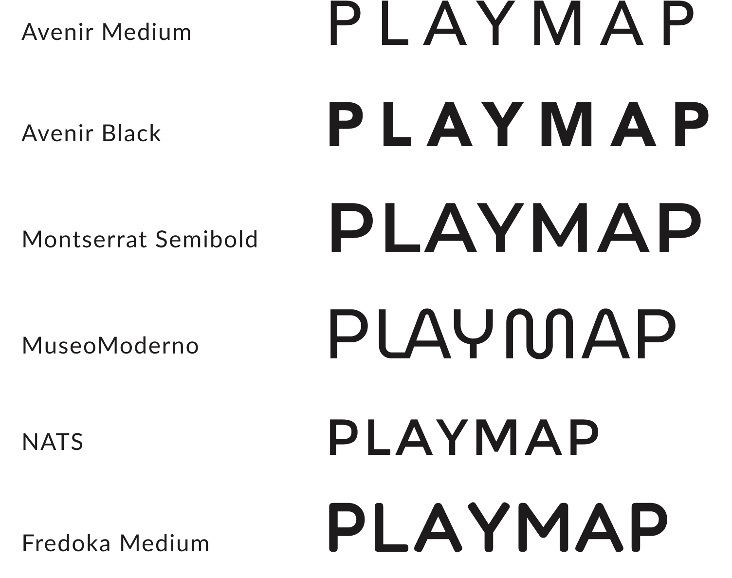
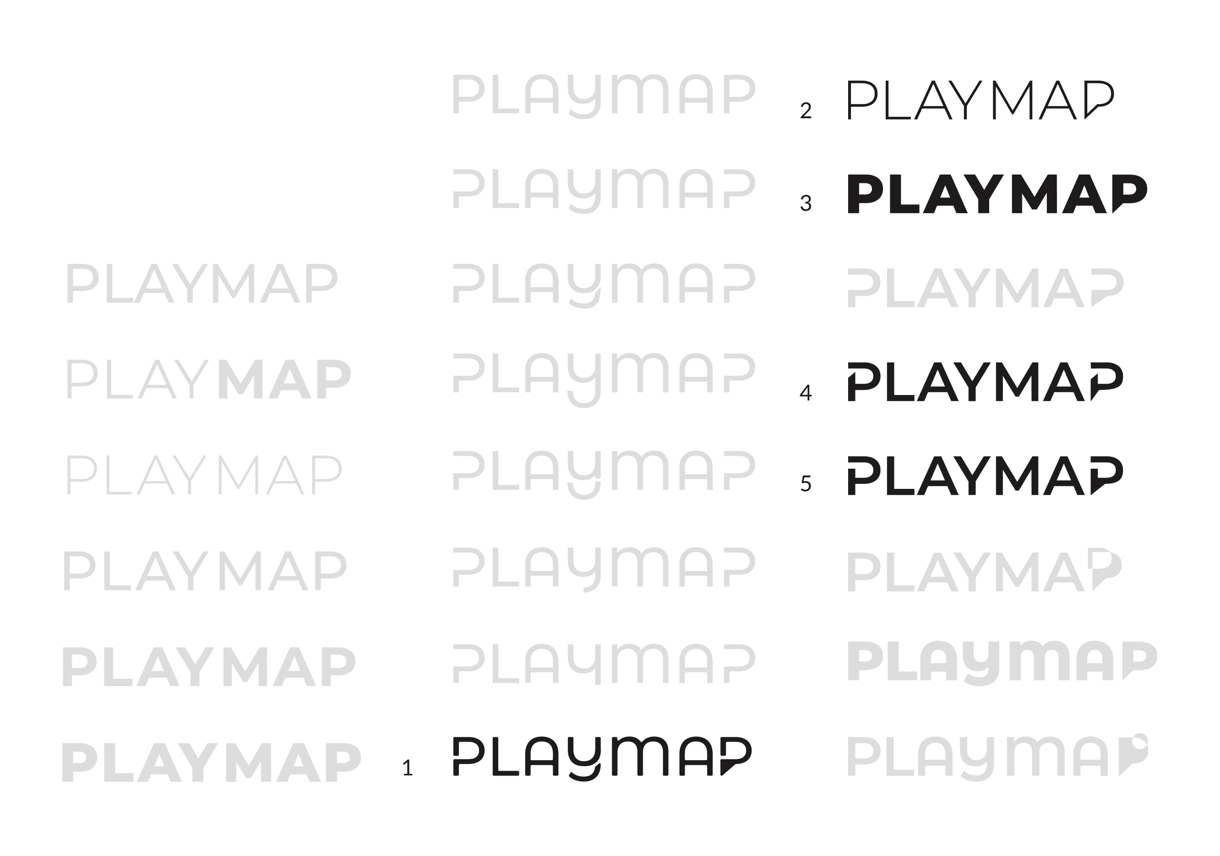
Choosing a typeface style is a big decision. I love the subtle curls and cutouts and I am inspired by all of these wordmarks but which is the right direction for PLAYMAP?
Typeface + wordmark exploration
Brand developmentI tested my brand name PLAYMAP with several typeface variations but I kept coming back to one in particular…Montserrat.
Montserrat is a geometric sans-serif typeface with numerous weights and alternates and remains legible even in small sizes.
I found it to be very versatile for this wordmark exploration.
I shortlisted my options to six then ultimately chose this one to represent the brand.
With Montserrat Extra Bold as the base, I manipulated the the final ‘P’ into a location pin—thinking of its future use as the application icon.


Color and contrast
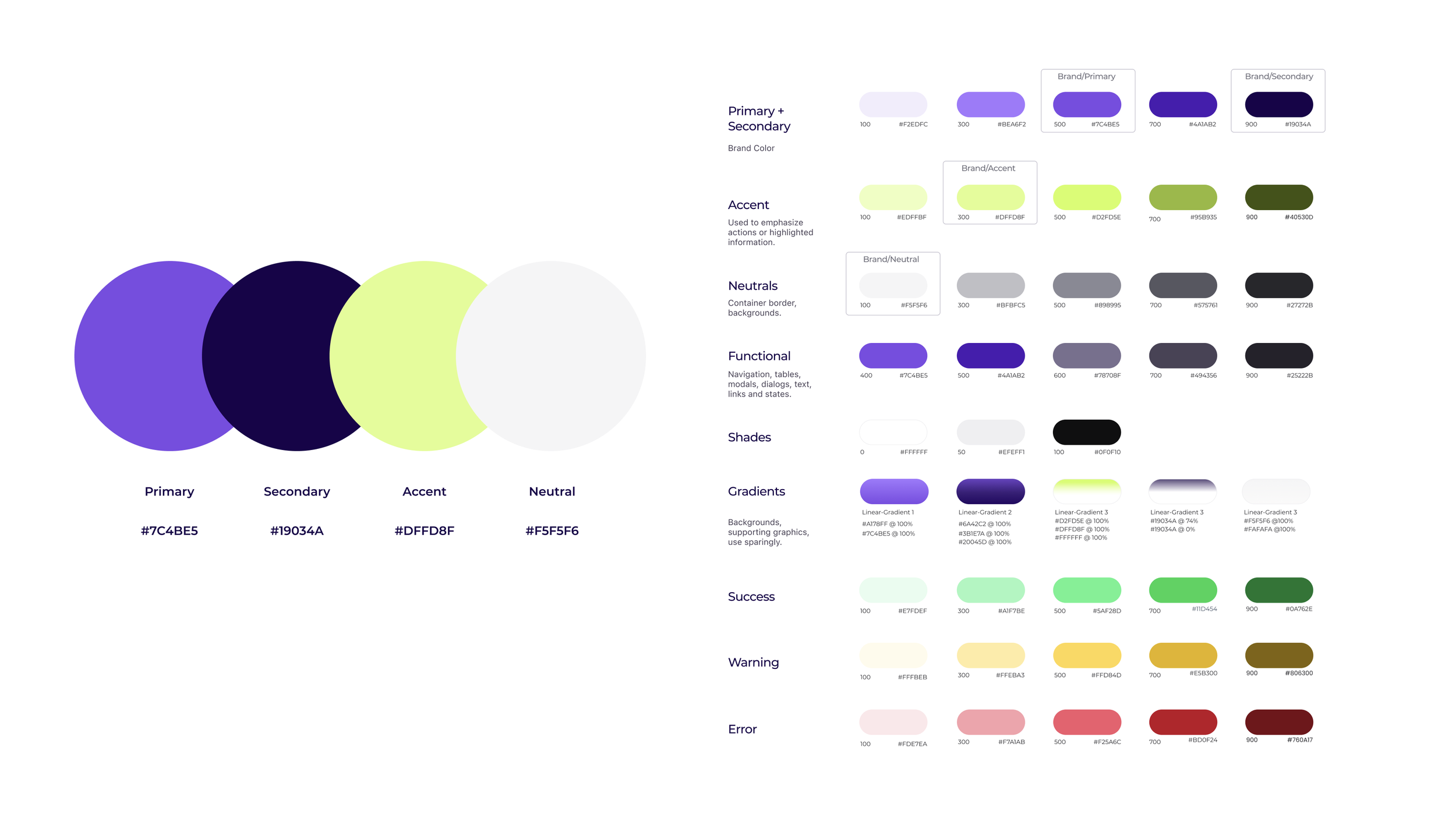
Brand developmentMy moodboard inspired me to choose these colour swatches.
I used a contrast checker that revealed some combinations didn’t pass the AAA or even AA test levels for accessibility.
Click image to enlarge
Deepening the value of my violet hue helped to bring my failed contrast scores up to AA & AAA levels.
I also adjusted my dark violet. The colors are now more rich and the light neon pops even more.
Click image to enlarge
Mobile App Design
Application icon
Inspired by a map pin, I turned the final ‘P’ of PLAYMAP into my app icon.
I explored different ways to use the colors in combination.
I chose icon 3 because it contrasts well on dark and light backgrounds and stands out from the other app icons.
UI Library
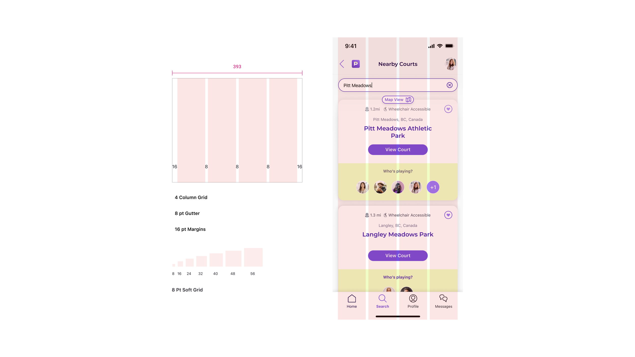
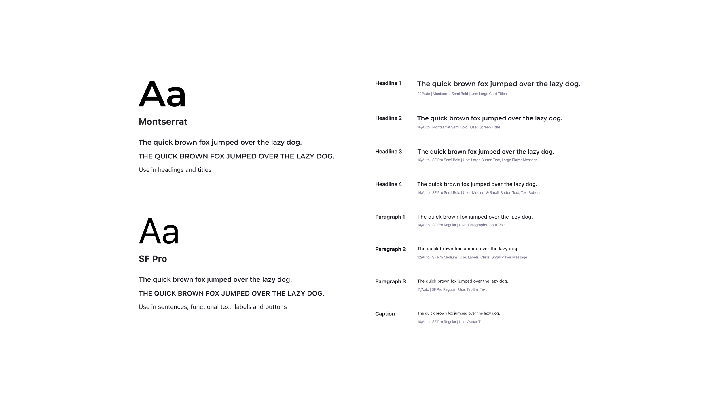
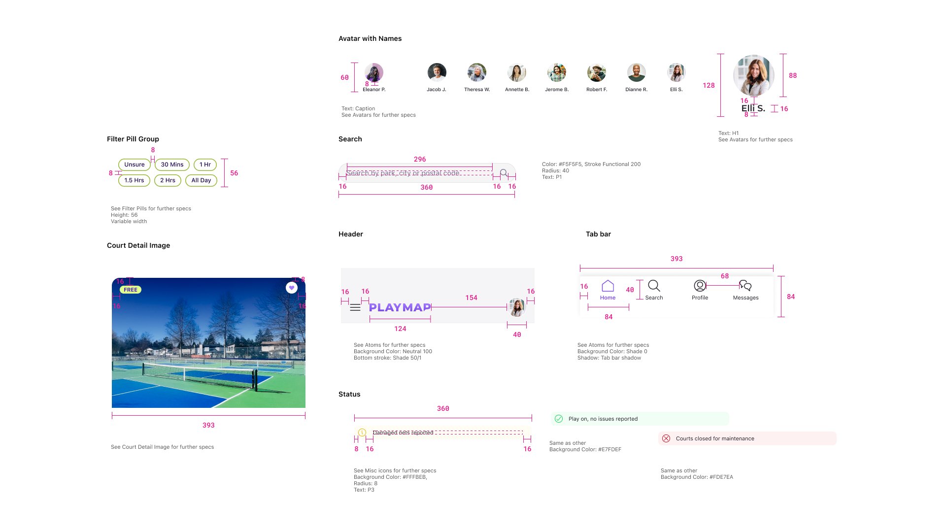
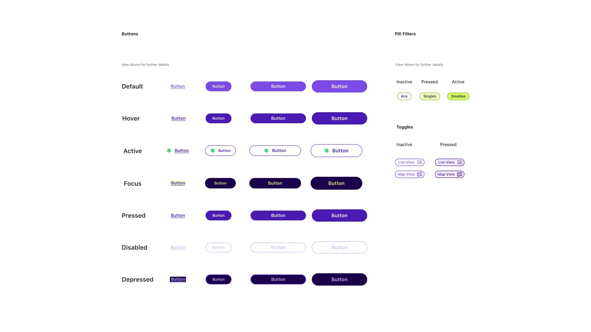
Mobile App DesignWhen designing my UI library, I followed the Atomic Design Methodology to develop an thoughtful design system. Here’s a small selection of my UI library.



Responsive web design
Marketing website
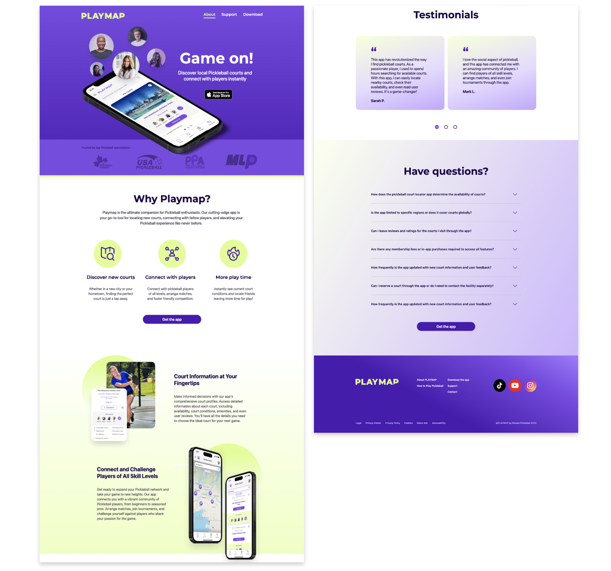
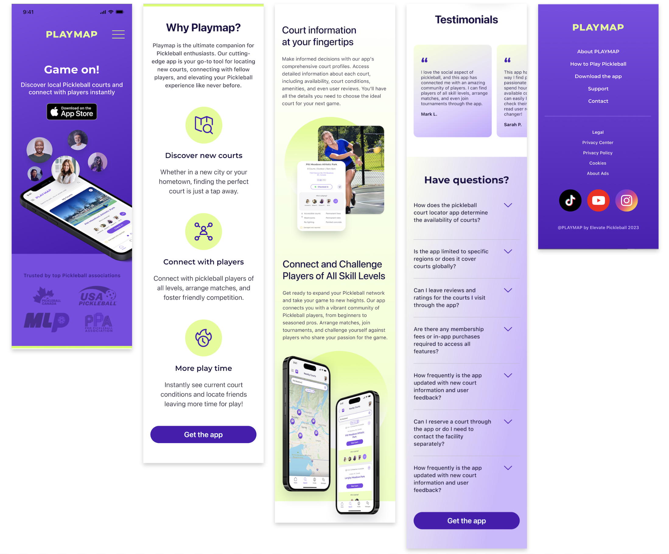
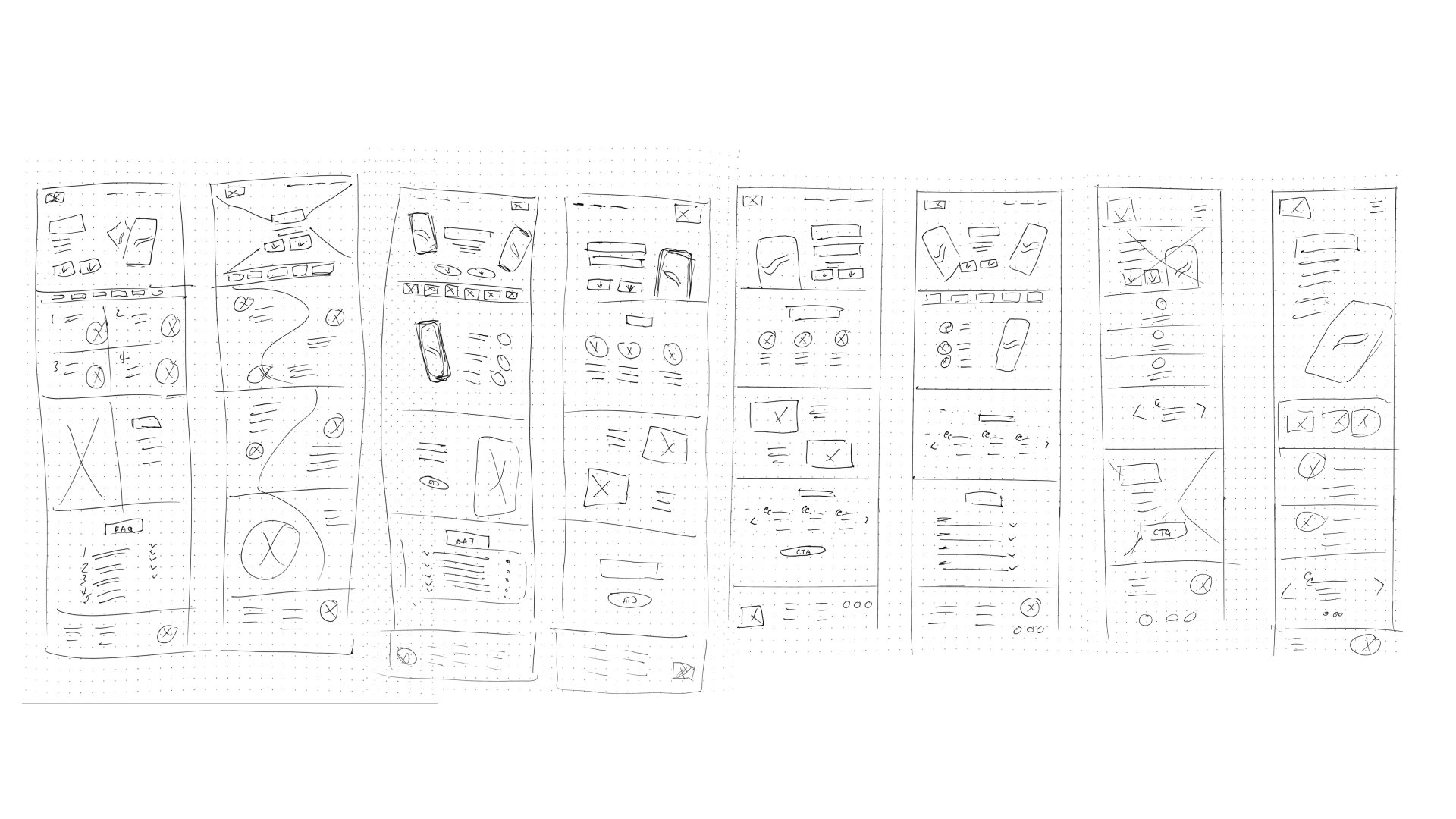
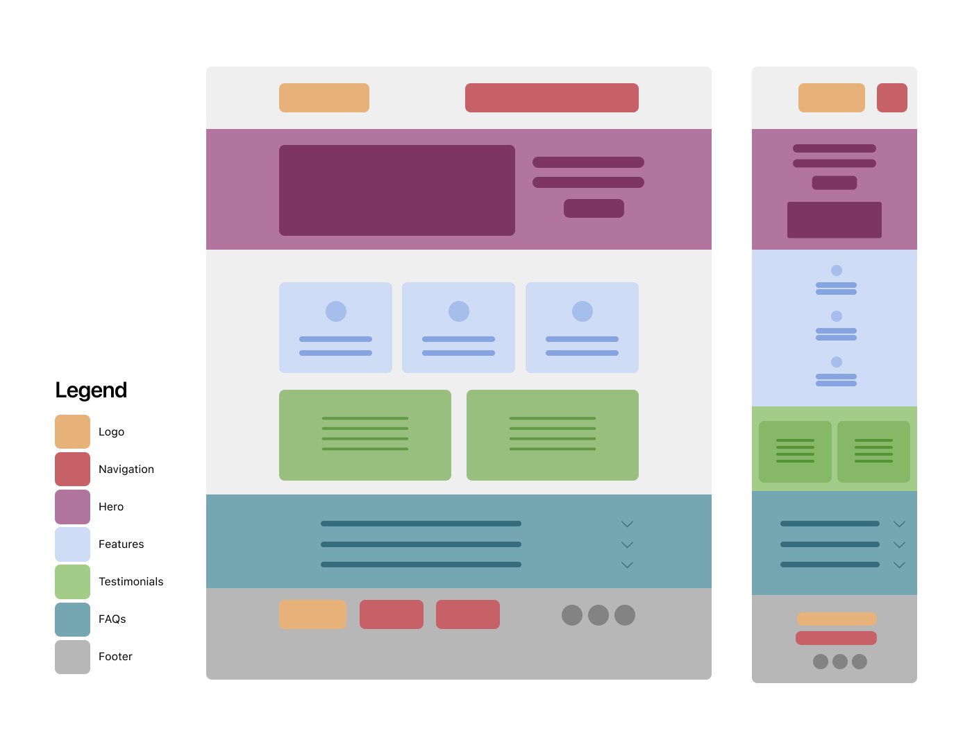
Following the same process as my app design, I designed my product marketing website for two devices. I designed a responsive layout for 16” Macbook and an iPhone 14 Pro. Additionally, I created a content flow diagram to demonstrate how web content will adjust between desktop and mobile viewports.

Apple watch
Alternate platforms
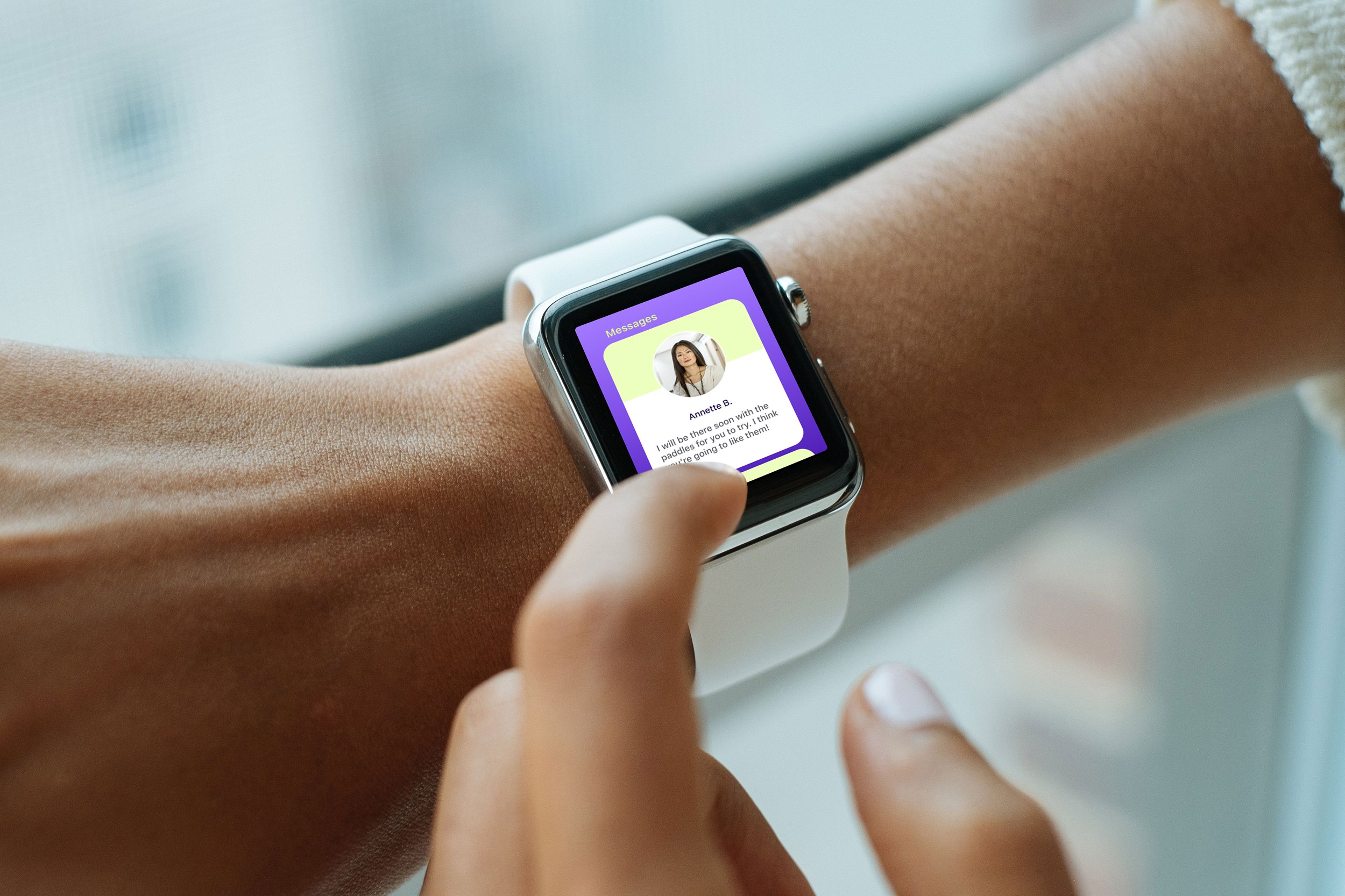
When thinking into the future about what screens to adapt my app for, Apple watch was my first thought as well as an Android mobile version. I hypothesize that my target audience would appreciate having access to this app when they are out playing in order to stay in touch with other player friends. They won’t necessarily have their phones on them but many do wear smart watches.
Check in screen
All messages screen
Message detail screen
Key learnings
Finding a suitable court can be difficult with the surge in players. However, the growth is also leading to more facilities, but not all are created equal.
With these factors in mind, having a way to view courts with useful information would allow players to see which ones are best for them.
Additionally, my user testing participants all expressed excitement about how this app could benefit them in finding the right places to play and connecting with other players. Also, they could see it being used for the other sports they play.
Next steps
Due to time contraints I wasn’t able to complete the high-fidelity prototyping of my messaging user flow. I would like to complete that as it’s a vital piece of my Value Proposition. Additionally, the other sections I would like to design for are the Training section with a personalized library of YouTube videos, a Teams section, and the Events section—for event and tournament planning.
I believe development of PLAYMAP would be a worthwhile endeavour to take on. Connecting with a developer partner to create a Proof of Concept is a future goal.
With successful launch of PLAYMAP for Pickleball, an additional goal is to launch the app for other sports communities such as hockey, baseball, softball, and more.
Impact of technology
Tarot cards of tech
As a final wrap up to the case study I’ll pull a card from the Tarot Cards of Tech and explore an issue that could apply to my app design.
“The Tarot Cards of Tech encourage creators to think about the outcomes technology can create, from unintended consequences to opportunities for positive change. The cards are our way of helping you gaze into the future to determine how to make your product the best it can be.”
-artefactgroup.com
The Big Bad Wolf
The card I pulled is The Big Bad Wolf: What could a bad actor do with your product?
As with any location tracking service there are risks and consequences if someone wishing to do harm got a hold of that information.
Possible ways to mitigate the risks could be to enable privacy settings such as:
only allow selected people or groups to see your whereabouts on maps, others would see a player but no personal info
enable anonymous mode - people can see there is a player at a location, but no specific personal info
allow users to disable location tracking altogether


